The Power of Three - Myths and Tips
- Bec Dreyer
- May 31, 2017
- 3 min read
If you've ever spoken to anyone who knows a little bit about styling, they will generally tell you that you need to decorate in threes. There is some truth in this but it's not gospel.

MYTH: EVERYTHING HAS TO BE STYLED IN THREES. A whole house will look pretty unusual if absolutely everything you have on display in your home is in little groups of three.
TIP:
When grouping in threes, try and use a triangle as a guide of how to position items. Vary heights and textures as well as complementary colours.
MYTH: IF NOT THREE IT HAS TO BE ODD NUMBERS.
The reason why THREE doesn't alway work is because sometimes the space doesn't lend itself to that little or that many. When trying to decide how many of something to work with it is GENERALLY better to work with odd numbers.
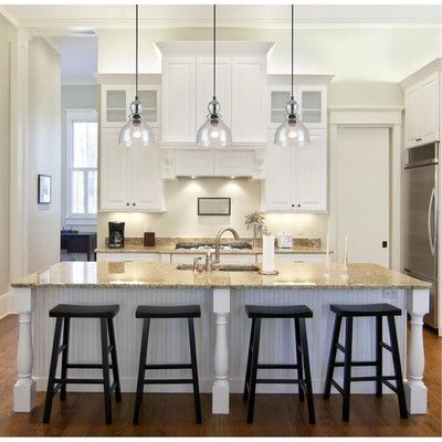
You may have a large space that may call for five or seven pendants in a row over a bar or reception area. Sometimes spaces may only need one.
Buuuuuutttttt......... It's OK to put two pendants in (generally if 'even', stagger the heights). The best way to determine this, is either test fit with your multiple options or if you're a superstar, try and visualise what it would look like in each combination. To be honest (or TBH for those millennials playing at home) the best way is to save yourself a truck load of time and energy, fighting with your significant other while the electrician is standing there rolling his eyes but counting his money, is to call me up and let me do the hard work for you.
CHAIRS and STOOLS are another example of the exception to the 'rule': Try to keep them even especially around a table because as humans we are more likely to be a group of even numbers.
TIP:
The most important thing to remember when styling is BALANCE and balance does not always mean symmetry, nor does it mean trying to stand on your hands (however, if you do stuff it up, it will look like a dogs breakfast).
Balance is where you make sure you have just the right amount of "X" in a space that is exactly what it calls for. For example you may have a tall feature floor lamp on one side of the room and offset it with a low lush plant of the other side of the room to BALANCE it out. Or on a table, have the balance of clear space, height differences and textures just right.
You don't need to have everything on display or go out of your way to "fill" your house.
Don't be afraid of CLEAR SPACE. Minimalism is one of the most endearing styles of design and can be so welcoming when executed correctly. Not every flat surface has to have something on it, floor space does not have to be filled and walls are allowed to be empty. Less clutter can be more stylish and give your home a very inspired look.
If you take anything from this; it's that there really are no rules, merely guidance and suggestions. Your ability to style right will be whether you can think out side the box and do what is right for your space. If you can't manage that on your own, thats where I come in - literally, right into your house.
Please go to the contact page if you would like to organise a consultation.
Bec xx


